Bundesliga


 Campeonato Brasileiro Serie A


 Chilean Primera Division


 Dutch Eredivisie

 EFL Championship


 J1 League


 La Liga


 Liga MX


 Liga Profesional


 Ligue 1


 MLS
MLS


 Premier League
 Primeira Liga


 Saudi Professional League


 Scottish Premiership


 Serie A


 Brasileiro Serie A Training Suit


 Bundesliga Training Suit


 Dutch Eredivisie Training Suit
 La Liga Training Suit


 Liga MX Training Suit
 Liga Portugal Training Suit
 Ligue 1 Training Suit


 MLS Training Suit
 Premier League Training Suit


 Saudi Professional League Training Suit

 Serie A Training Suit


Introduction:
An Unveiling that Captivated Cape Town
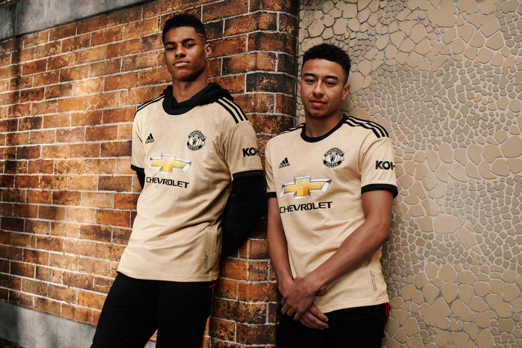
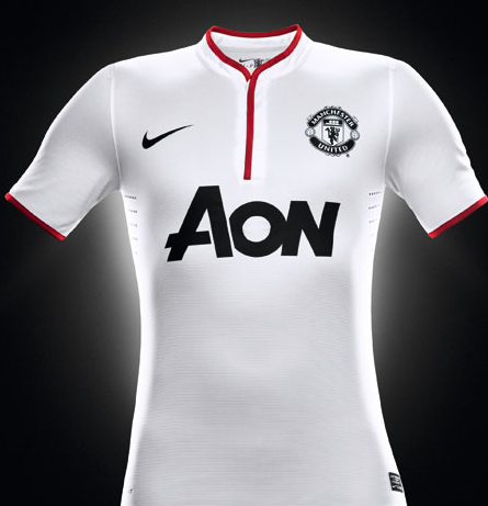
Nike today unfurled a significant update for the football world in Cape Town, South Africa, introducing Manchester United’s new away kit for the upcoming 2012-13 season. This release demonstrates a clever integration of modern aesthetics with traditional elements, a design that perfectly encapsulates the club’s audacious spirit and its readiness to confront challenges head-on.

Part I:
Turning a New Page in Style: The Ensemble of the New Kit
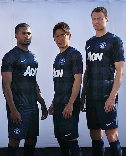
The new away kit stands out with its clean and crisp visual harmony of a white shirt, black shorts, and white socks. This fresh look is set to dress Manchester United players in their away games during the upcoming season, expressing their bold approach and perseverance. The carefully chosen palette symbolizes the team’s unwavering will to navigate adversities, mirroring their constant pursuit of excellence on unfamiliar turfs.
Part II:
Harmony in Design: The Classic Henley Crew Collar
In an interesting twist, the new shirt includes a classic Henley Crew collar, marrying style and comfort in an understated yet impressive manner. The collar houses a lengthy red trim that extends to the chest, adding a distinctive dash of color to the white backdrop. This elongated trim resonates with the club’s fiery passion, illustrating their hunger for success in every challenge they undertake.

Part III:
Drawing on Heritage: The Nuanced Detailing
The detailing on the new kit is a masterstroke, enhancing its appeal while rooting it deeply in the club’s heritage. The team crest and sponsor logo on the chest are done up in black, creating a stunning contrast against the predominantly white shirt. The globally recognized Red Devil symbol, an emblem synonymous with Manchester United, graces the outer part of the collar. This iconic detail forges a visual connection between the club’s past glory and its future ambitions, proudly broadcasting Manchester United’s identity to the world.
Part IV:
Echos of Home: Checkered Pattern on the Shorts
Adding a degree of continuity to the new kit design, the black shorts sport a classic checkered pattern. This pattern subtly mirrors the design aesthetics of the new season’s home kit, maintaining a thread of consistency across both home and away attire. This thoughtful design synchronization further emphasizes Manchester United’s unwavering identity, portraying a club that remains true to its roots, irrespective of the field they play on.
Conclusion:
Fusing Past and Present: A Vision for the Future
The new 2012-13 away kit, a product of the collaboration between Manchester United and Nike, is a fitting tribute to the club’s illustrious past and a bold signal of its vision for the future. As the team prepares to embark on the new season, this kit represents more than just a new set of clothes. It stands as their emblem for away games, a symbol of their relentless quest for victory, and a statement of their ambitious aspirations. As we look forward to seeing this fresh kit in action, we are reminded that this is more than just a uniform – it is another vibrant chapter in the glorious narrative of Manchester United.