Bundesliga


 Campeonato Brasileiro Serie A
 Chilean Primera Division


 Dutch Eredivisie

 EFL Championship


 J1 League
 La Liga


 Liga MX


 Liga Profesional


 Ligue 1


 MLS
MLS


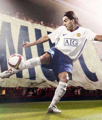
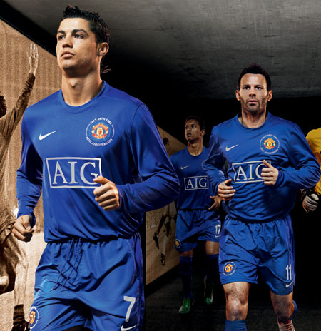
 Premier League
 Primeira Liga


 Saudi Professional League


 Scottish Premiership


 Serie A


Setting the Stage: Unveiling the 2012-13 Home Kit
Renowned globally for its prowess on the football field, Manchester United Football Club boasts a rich history interwoven with strikingly distinctive kit designs. The 2012-13 season was no exception, as the club unveiled a home kit that elegantly captured Manchester’s dynamic past, infusing it with a modern twist. This unique blend of history and present made the equipment a true standout, elevating it from mere sportswear to a symbol of the city’s and the club’s spirit.

Revisiting the Industrial Past: The Checkered Cotton Pattern
The home kit’s primary appeal lay in its distinctive checkered cotton pattern, a salient tribute to Manchester’s iconic cotton mills. Since the mid-18th century, Manchester had established itself as a thriving hub of textile manufacturing, with its checkered cotton fabrics gaining recognition far beyond city limits. The decision to embody this pattern in the kit not only represented a nod to Manchester’s glorious industrial past but also created a visual link between the city’s history and the club’s legacy.
This symbolically rich pattern was masterfully rendered in Manchester United’s classic shade of red. This choice of color ensured the shirt was immediately recognizable and visually arresting, a sartorial embodiment of the passion and energy the club is known for.
Bridging the Past and the Present: Contemporary Design Elements
The kit didn’t rest on history and tradition alone. Complementing the historic checkered pattern was a modern and sleek black V-neck, offering a visually compelling contrast to the vibrant red and adding an air of contemporary elegance.
Adding another layer of depth was a brief but powerful inscription on the collar’s inside: “Forged in Industry, Striving for Glory.” This inscription eloquently encapsulated the city’s dynamic past and the football club’s relentless quest for glory, serving as a rallying cry that resonates with Manchester United’s ethos.

A Symbol of Global Influence: The Iconic Red Devils Emblem
The kit proudly displayed the universally recognized Red Devils emblem on the collar’s outer part. This potent symbol of Manchester United’s global influence further emphasized the club’s historical significance and prominent position in the football world.
Accompanying the vibrant shirt, the players’ white shorts featured a subtle diagonal shadow pattern, an innovative design that echoed the shirt’s checkered pattern. Completing the ensemble, the black socks were stylishly designed with red accents and the iconic white devil’s symbol.
A Marriage of Style and Comfort: Advanced Design Features
These socks were aesthetically pleasing and represented a significant stride in kit design innovation. Featuring advanced cotton padding, these socks provided essential support and promised unparalleled comfort for everyone, from professional players to casual fans.

In Conclusion: A Tribute to Manchester United’s Legacy
In essence, Manchester United’s 2012-13 home kit is a celebration of the club’s rich past and continuous evolution. Harmoniously integrating historical elements with modern design, the kit eloquently narrates a tale of respect for tradition, diligent labor, and the unwavering pursuit of glory. Beyond its aesthetic appeal, this kit represents the club’s significant place in football history. It reminds fans worldwide that Manchester United, much like Manchester’s globally acclaimed checkered cotton, continues to make a mark on the world stage.